


Increasing Radio Signal
Introducing a mobile application designed to connect global fans with their favorite band, Radio Company. Running from January to February 2024, the challenge was to enhance their mobile presence beyond social media, offering e-commerce features and multilingual updates. As the Project Lead and UX enthusiast, my responsibilities included project management, user research, wireframing, design, prototyping, graphic design, and quality assurance.
Problem Statement: Radio Company has discovered that they now have an international fan base. They want a way to allow their fans to interact and support them without having to jump through a bunch of hoops.
And what that looks like:
User
Research
Personas
Problem
Statements
User Journey Maps
The user research consisted of:
-
Secondary research on their social media, Spotify and YouTube
-
Primary research on the prototypes of the application
Assumptions
-
Initially: That Radio Company’s fan base was North American
-
After Research: They actually have an international fanbase
Users want to be able to purchase tickets to shows without having to jump to multiple sites and platforms.
Users want to be able to keep up with the band in one place.
International Users want to be able to navigate content in their own language.
International users want to be able to purchase band merchandise without multiple costly shopping accounts.


Olivia's Goals
-
Accessible Exploration:
-
Easily explore and purchase sheet music and band merchandise through an accessible interface that accommodates Olivia's vision impairment.
-
-
Music Education:
-
Access a diverse range of sheet music to enhance Olivia's music education curriculum, catering to various genres and instruments.
-
-
Efficient Organization:
-
Use the application to efficiently organize and manage purchased sheet music, making it accessible for lesson planning and personal practice.
-
Olivia's Frustrations
-
Music Selection:
-
Facing limitations in the variety of available sheet music, hindering Sophie's ability to find diverse pieces that her students will be willing to practice.
-
-
Genre/Instrument Gaps:
-
Difficulty finding sheet music that covers a wide range of genres and instruments for Olivia's diverse teaching and personal musical interests.
-

Elijah's Goals
-
Cultural Exploration:
-
Discover and purchase band merchandise that allows Elijah to learn more about music from North America.
-
-
Streamlined Purchases:
-
Experience a streamlined and user-friendly process for purchasing, catering to Elijah's tech-savvy preferences.
-
-
Collaborative Discovery:
-
Engage in a collaborative and social aspect of music discovery, sharing recommendations and discussing purchases with his roommates through the application.
-
Elijah's Frustrations
-
Limited Language Representation:
-
His English proficiency is limited and would like to navigate site with his own language.
-
-
Complicated Purchasing Process:
-
Dealing with a complicated and cumbersome purchasing process, deterring Elijah from exploring and buying new music and merchandise.
-

Sophie's Goals
-
Client Relationships:
-
Enhance client interactions by gifting tickets for shows, strengthening professional relationships.
-
-
Efficiency:
-
Instead of multiple applications, using a one stop shop will allow Sophie to keep up with her musical interests.
-
-
Balance
-
Sophie wants to balance her passions with her work life. With a business and family, she has a hard time making room for her musical passions.
-
Sophie's Frustrations
-
Security:
-
Requiring too many complicated shopping accounts to purchase items is a security risk for Sophie’s business and personal accounts.
-
-
Account Management:
-
With many accounts for everything, Sophie gets frustrated having to sign up for everything, which is hard to keep track.
-

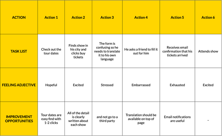
Goal: Purchase sheet music quickly and access it.
-
The search process is the first risky point. If it’s too complicated, it can deter users.
-
The main point of frustration is purchasing.
-
Needs to be compatible with screenreader and use semantics.

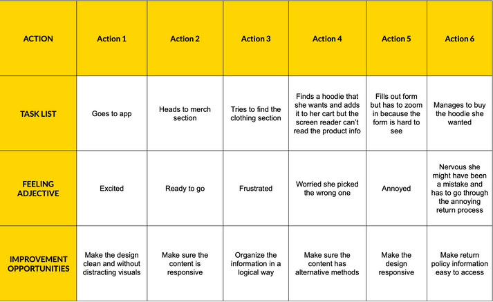
Goal: Purchase a ticket for a show
-
The language of forms can be confusing.
-
Having to ask for help is a major pain point because help isn’t available 24/7.
-
Having in-built language options will make it easier and not require auto-translation.

Goal: Purchase a hoodie.
-
White space and simple process will make a world of difference.
-
Flexibility is essential.

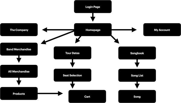
Sitemap
The sitemap emphasizes simplicity, enabling users to move through the app with ease. By adhering to a logical pattern, the user journey becomes more intuitive, enhancing overall usability. The emphasis on free navigation ensures that users can explore the app and website with minimal friction, contributing to a positive and efficient user experience.
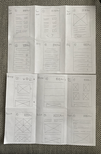
Wireframes
Crafted with a modular layout, our wireframes for the application embody simplicity and efficiency. These designs ensure a streamlined and user-friendly experience, making navigation a breeze for global fans engaging with Radio Company's mobile app.

Digital Wireframes
The focus was on streamlining interactions.
The design adopted a mixed classic ecommerce layout, avoiding unnecessary elements for a clean and focused experience. Following feedback, a space for a language icon was implemented along with a simple sticky menu, using a menu instead of the hamburger icon for clearer navigation. Additionally, a combination of section-based and card-based layouts, coupled with strategic use of white space, was introduced for responsive design, ensuring a seamless and adaptable user experience across various screen sizes.


Low-Fidelity Prototype
The user feedback for the low-fidelity prototype highlighted several key points for improvement. Users suggested that relocating the menu to the would enhance accessibility for those with motor concerns. Concerns were raised regarding color contrast, indicating a need for adjustments to improve visual clarity. Typography challenges were noted, particularly in vertical and landscape formats, suggesting a need for better readability. Additionally, users found double divisions unnecessary and potentially distracting for screen readers, emphasizing the importance of simplifying the interface for a more user-friendly experience.


Unmoderated Usability Study
Location: Canada, Remote
Participants: 5 in total
Length: 20-30 mins
Design Refinement
Additional function indicators were introduced for clarity, aiding users in navigating the interface. The option to select sizes and add more items was integrated, providing users with increased flexibility and customization. Furthermore, a refined typographic hierarchy was implemented, contributing to improved readability and visual organization within the app design. The contrast with the colours was enhanced and finalized. The design and experience went through 4 iterations.


Design Refinement - Hi- Fidelity��


Design Refinement - Hi- Fidelity Round Two


The Project-Level: The design can double very well as a responsive web design on mobile due to the its progressive enhancement approach.
The Brand: The brand uses a very simple and clean style that translates nicely across multiple platforms and devices.
The Process: By identifying edge cases, I was able to take into account additional needs and opportunities.
The Goal: By creating this e-commerce and social application, fans can concentrate their support by engaging with the band in one place, with one account with ease.
Biggest Learning: The biggest learning from this case study is working through designer bias. By keeping my focus on the users, I was able to make something engaging.